Tutorial: Stationery Styling Like A Pro!

Because sometimes you have to be the stationery stylist and photographer too! And I'll break down some of my little tricks to get the pro look! :)
If you guys missed out, I dished out some of my tips for collaborating and making the most of your styled shoot experience. Other than all those, there is one more trick up my sleeve to secure collaborations and it's styling. Specifically, all the stationery styling! By having my calligraphy work styled as professionally as I could, this makes it much easier the first few photographers to take the leap of faith and put their trust in me.
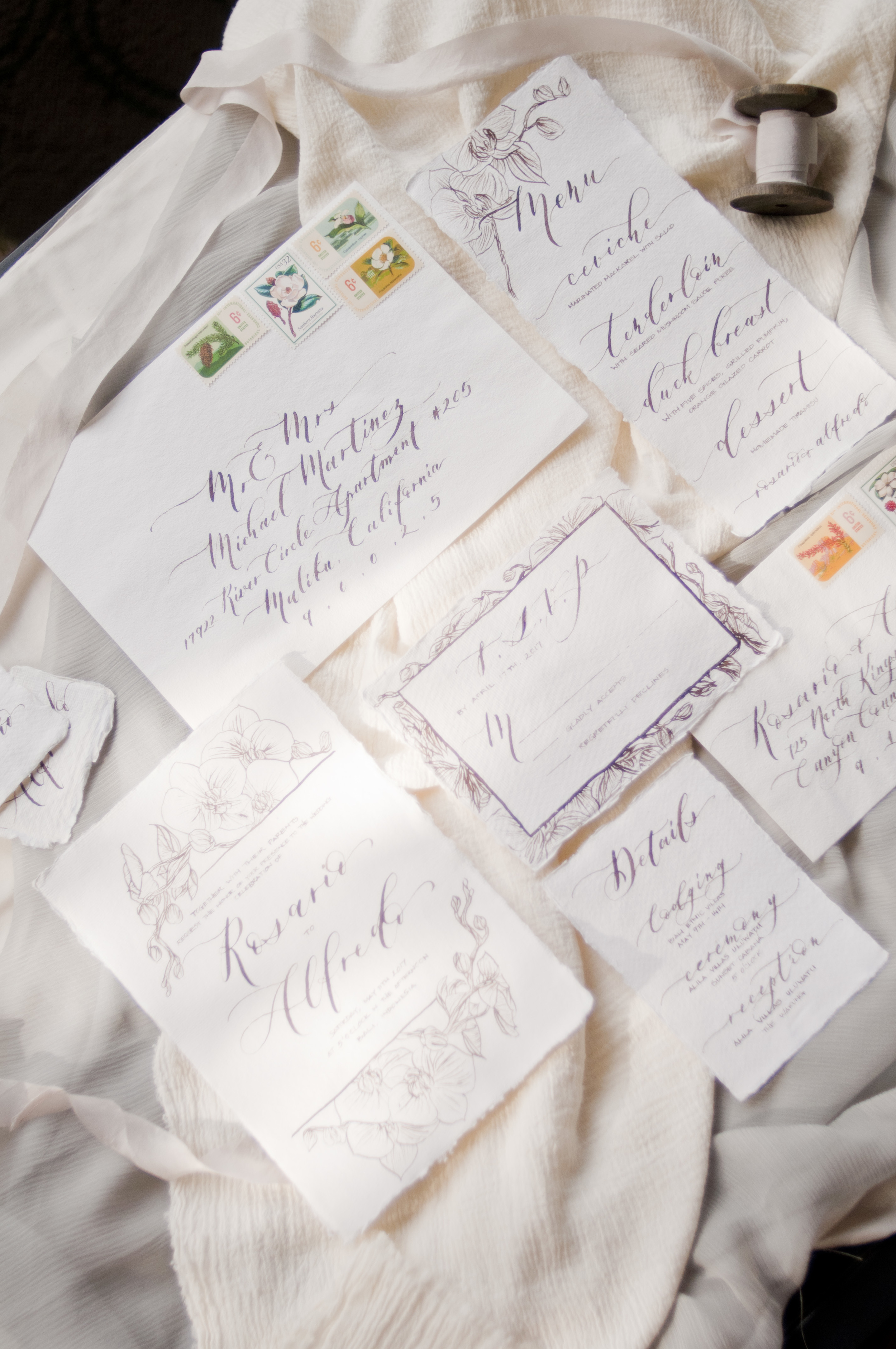
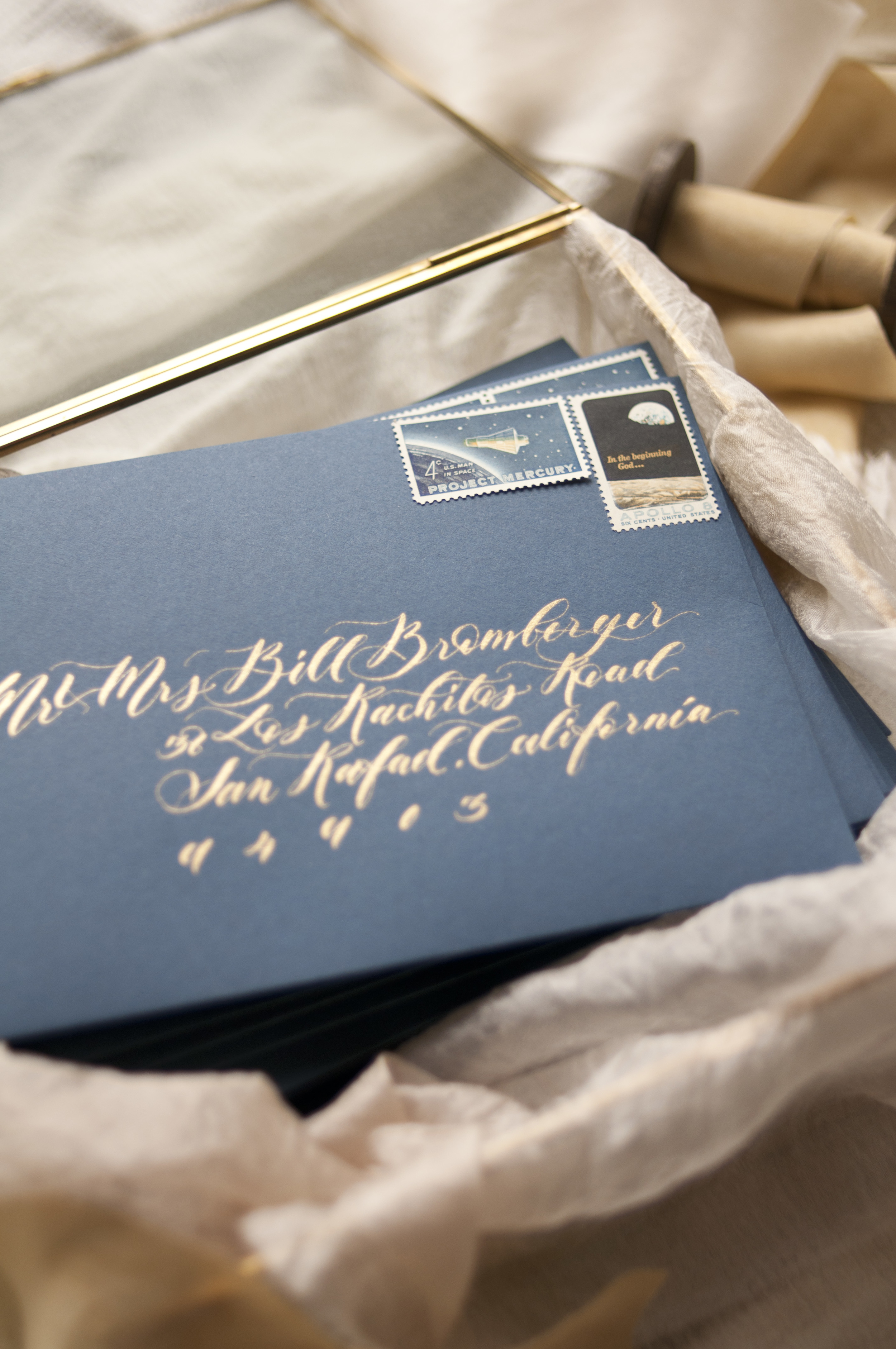
"Now that you have done so many styled shoots, do you still have to style your own stationery?", most people asked. You bet and here's why. There are certain shoot only I could take such as the stack of perfectly addressed envelopes or posting a sneak peek and progress photo of my stationery prior to the styled shoot. There's certain detail elements that can be easily overlook but very important for me such as that close up shot of the wax seal for my Stamptitude's collection or the texture and sheen of the invitation paper. And sometimes I just need great quality photographs for my Etsy store as soon as possible. To top if off, I usually got the full freedom to style the paper goods to my liking when I tag along on a styled shoot. It's even more reason to make sure my styling game is top notch!
So let's rewind the tape a little bit. When I first started, my styling was pretty mediocre. Ok, fine. I’ll admit it was quite a struggle because I don't know what to do. But over time with the help of many styling inspirations, lots of trial and error, and watching some stylists working their magic during styled shoots; I started developing my own little quirks and basically streamline my styling process. So here's a few of my go-to styling tips that I hope will inspire you to develop your own!
1. Natural Light
See that hot spots? You don't want that! So whenever possible, find a perfectly shaded area or do your photos during overcast day.
Because nothing beats the beautiful natural light unless you have a full-blown studio set up. Indoor lighting is basically a fluorescent (green) or incandescent-like (yellow) fixture. Your eye might not notice the difference, but your camera does. These types of lighting sources just don't do justice on all your hard work!
But beware. You can't use all natural light. When used incorrectly, direct natural light can be too sharp, adding shadows in all the wrong places, and you want to avoid hot spots/shadow spots when possible. So a nice, indirect light with consistent shadow is the most ideal. For me, this makes my shaded patio an ideal place to double as my photo "studio". Due to the direction of my apartment, I only have direct sunlight for a couple hours a day (score!).
2. Neutral backdrop

I purchase some left-over gauze fabric from my local fabric store and I basically use it in most of my styling! I would then layered it with some gorgeous colored fabric like this beautiful sheer Silk and Willow fabric.
I tend to use my black glass coffee table with layers of neutral fabrics (and I LOVE the layered looks). When I want to bring some rustic warmth, I lay my leftover Stikwood panels on top of my coffee table. I know some people love to use styling boards with neutral fabric like the ones sold by Heirloom Bindery. I've even used the pebble stone pavement and the wood decking by the pool during my vacation. I've seen my stationery being styled in different flooring material such as wood, concrete, marble, and even on a tray that is propped on top of lavender flower. So feel free to be creative with your backdrops and keep your eyes open for beautiful textures that are at your disposal!
Oh, and speaking of fabric background, I finally purchased Silk and Willow's medium weave runner. So watch out world, that beautiful grey fabric going to make appearance in so many photos!
3. Props
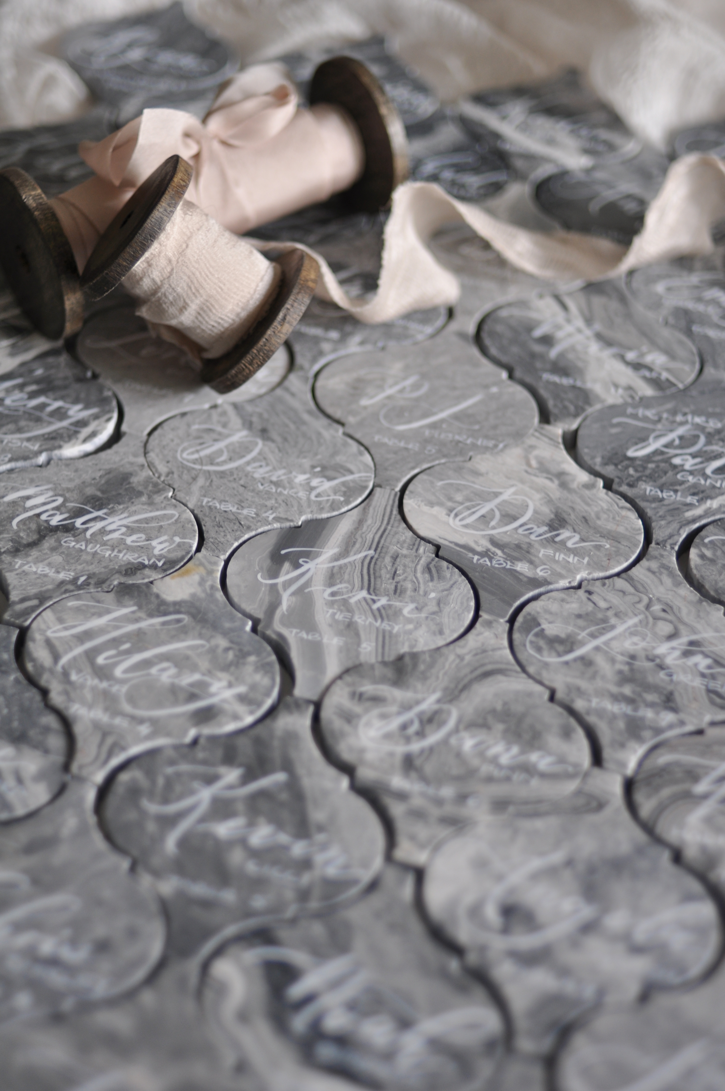
I am proud to say I've master the skill of stacking two Silk and Willow's spools without rolling!!! Woot woot!!
I have a few favorites from my thrift-store hunt vintage tray, West Elm's glass box, CB2's marble cheese platter, many Silk and Willow ribbons, different wax stamps, vintage stamps, my trusted succulents, and fresh botanical when possible. Fresh flowers are my favorite, which is why I love tagging along during local styled shoots because I get to take home some of the goodies!
Just because I have a few of my go-to items, doesn't mean I need to use all of them. Keep the props to a minimum because the stationery should be the star of the photograph, not the other way around. A good rule of thumb is…. You want backdrops that are big enough for your stationery to be lay on (tray, styling board, glass shadow box, etc.) and keep things that goes on top of the paper small (ring, ribbon, etc). Make sure you're ribbons aren’t too big and over-powering the paper. I like to keep my big items more neutral and make sure my small accent pieces are color coordinated with my suites.
One thing still on my wish list is a sexy vintage scissor along with a Mrs. ring box! One day I'm telling you, one day…
4. Layouts

Honestly, I have a whooping 3 basic layouts I use all the time and do some variation in props and colors.
Oh bother…. This is the hardest part in terms of styling and explaining so please email, comment, or message me if you need further explanation. It's super important because this can make or break your photographs. Different people have different styles but I’ve develop my own quirks (and you should too), especially for my layout.
I like some of my pieces to overlap with each other. Some need to have a perfect gap with each other. Too much overlap makes the whole photograph look crowded and messy. No overlap looks boring and doesn’t play off each other. Usually I try to overlap the invitation with a some of the envelopes. This adds more contrast. I don't like when front addressing and RSVP return addressing are next to each other, so I usually try to put them on opposite corners. I hate the straight lines or when people don't utilize the envelope liners because it's the easiest way to break the boring rectangular shapes of the paper.
Since the end product will pretty much be a photograph, you want to compose the paper elements like that. Make sure there's some “negative space” in the photograph. I like the composition where the layout doesn’t end up looking like a box within a box. That's too rigid for my taste. Arrange the stationery and all the props in a way that forces your eyes to move around the whole layout. This means you shouldn't put all the color elements in one half of the photograph and all the neutral whites on the other. Instead, sprinkle some of the color elements throughout. Try not to put the highest contrast items right in the dead center because this will stop your eyes from moving around the photograph. Create movement with ribbons, fabric background, flower petals, or even some greenery. Incorporate textures and layers when possible.
Once you have a few layouts you like, keep a good photo of them so you can refer to it later on. Lastly, make sure all the edges are perfectly straight. Easier said than done especially when styling on top of fluffy fabric, but try! And make sure that any props you're using do not cover up the most important selling point of your shoot (invitation design and addressing for me).
DSLR with proper lens makes it much easier to achieve this result. Ready to use on my Etsy listing!
Now that we have all the different elements worked out, all you need is to take bunch of awesome photographs! When I still had my day job, I did many photos straight from my iPhone and they worked well. But now days, I took photos with my (baby) DSLR which gives me better resolution and a professional quality that I can use for my Etsy listings or portfolio images on my website. If you're curious, I have Nikon D5500 and a 35mm Nikor lens. The second part makes auto-focus non-existence for my non-professional DSLR so it's a bit of hassle. Some basic photograph skills are necessary!
So hopefully some of these tips can help turn your styling game up a notch! I would love to hear what you think or if you have any additional tips of your own :)
Much love,
Ruth